Wednesday, 24 February 2010
Tuesday, 23 February 2010
Target Market Research - Questionnaire.
Front Cover
What are your initial thoughts at looking at the magazine?
Do you like the choice of colour palette? If so, why? If not, why?
Do you think the photograph and its shot type, fits the genre of the magazine? Why?
What are your thoughts on the name of the magazine, "in flux"?
Does the layout, e.g. coverlines, masthead, strapline work well? If so, why? If not, why?
If you could change one thing about the front cover, what would you change?
Give one positive and negative comment about this page.
Contents page
Do you think that information of the magazine is easy to find? If so, why? If not, why?
Do you think the layout/idea is original? If so, why? If not, why?
Give one positive and negative comment about this page.
Double page spread
What is your favourite part of the page?
What is your least favourite part of the page?
On the initial viewing do you feel interested enough to read the article? If so, why? If not, why?
Does this page appeal to you aesthetically? If so, why? If not, why?
Give one positive and negative comment about this page.
Sunday, 21 February 2010
Quick edits
Magazine photoshoot

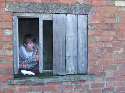
On the 21st of February I took the photos for my magazine, I used Jamie Hives an 18 year old student for this as I thought his overall look fitted the look for the magazine. I chose his outfits, and tried to make use of statement colours and patterns so that I can add handmade effects like when I draw on buttons, (hence the fact that I chose clothing with bold pictures such as the rocket, and eyeball). I wanted to keep his look bright but also relatively smart and stylish to fit in with the fashion theme. I thought the weather, along with the strong natural light (helped along by the reflections from the snow) was perfect for my photography. From a film of almost 100 photographs, i've condensed them down to my favourite 39. Most of my photographs I kept relatively simple so that I can cut out the background and make it white, but I also used some derelict barns to add a different look, and I personally love them photos. I've also decided to make this a winter special magazine, that looks forward to the upcoming summer, (hence the snowy weather). On a few of the close up photo's I used a burst setting to try and capture many random expressions, and then single out the best ones. Overall I am very happy with my film of photos, and look forward to editting them further to see the outcome.
Friday, 12 February 2010
Thursday, 11 February 2010
Possible shots for Finished Magazine


These are shots that I think would work well with my magazine I really like the last two photos as I think they're different and quite striking, i'm very drawn towards the final picture as I think it would look good, but also fit the genre of magazine i'm hoping to create. I think it looks happy, interesting and textural. I think the lighting is used well and I love the expression, a definite influence on my magazine cover.
Draft Music Magazine

This is my front cover draft, i'm happy with the fact that it fits my original draft e.g. use of handwritten font, pastel colours, textural. This is very basic to what I would like to finally create, but it includes mostly all of the things that I will use in the final product e.g. masthead, strap line, cover lines, barcode, etc. I tried to tie in all the elements of the magazine, I made pastel coloured buttons for josh's top to fit in with the pastel colour palette, I used the same colours with text repetitively, I used the same font, I used the button effect on the issue date to match the button effect at the top of the page. Overall I generally am happy with this, but in my final product I will be using a different model, I will be adding more textural effects (as I find the page a little bare) and I will be playing around with other fonts and magazine elements. Overall I give this draft front cover a 7/10
Subscribe to:
Comments (Atom)


