Monday, 14 December 2009

Target Audience Case Study


This is Jessica Smith, she is 18 years old and is from Central London. She studies media and art A levels at Duff Miller sixth form college. Living in such a lively area she spends a lot of her time listening to music on-the-go, mostly this is quite unheard of bands, that were formed locally to her - aswell as mainstream bands. Her favourite band is the Arctic Monkeys, as she believes they created an individual sound that many bands are trying to imitate. She spends a lot of her time socialising with friends at trendy bars in and around London. Because of this, and where she lives she is very fashion consious and believes a lot in individuality. Her favourite shops are Topshop Zara and Allsaints, as well as these she buys a lot of her clothes from small individual boutiques. When she gets time she enjoys watching films - more so than television. Her favourite films are

Friday, 11 December 2009

Choosing my Font

I want a font that looks quite handwritten but still has a sense of animation. I think i'm seeking for this type of font, because I don't see many magazines with this type of writing currently, and I really want to produce a unique-looking magazine. After looking at various fonts on websites, I have found my favourite four. I downloaded these fonts and typed the two magazine names I have to decide between. They are all from the website; www.DaFont.com I will give each font a score out of 10, against my original brief for my magazine.
The first font is called 'Baby Don't Worry' I like this font because it's not formal and gives quite an impact, but I do not like how bold the font is. I give this font 6/10
The second font is called 'Pea Weenie' this is a fun looking font, but the sharp lines make it seem more masculine than feminine, and i want to aim my magazine at women - not men! I give this font 7/10
The third font is called 'Arsenale White' it is a very flowing font, so much so that it is a little hard to read. It definitely comes across as feminine and fit's the handwritten theme I am seeking for. I give this font 9/10
The fourth font is called 'Cat's Awesome Font' it looks very handmade which I like, but isn't very flowing and in keeps with quite a masculine style. I give this font 7/10
After reviewing the fonts, it has been decided that 'Arsenale White' is my favourite font, although it is a little hard to read I feel that keeps with the 'handmade' look of the magazine.

Possible Magazine Names

Magazines that I have personally read that tend to be quite individual, have always acquired quite short names, e.g Love. I really like this idea, as it keeps the name in the forefront of someone's mind, so that whenever the word is used it can instantly be recognised as the magazine in question. With this in mind I went on to come up with 18 possible names for my magazine, although many are not - I tried to keep it down to one syllable so that it flows better, and is easier to pronounce. These are what I came up with; boom, type, beat, block, chune, phase, sync, tempo, blast, muse, channel, flaw, flux, scale, box, u.a.c (up and coming), pitch, base. I then managed to shorten the list down to a final two, this being ‘beat’ and ‘flux.’ I chose these as I feel they represent strong meanings. Beat is obviously recognized in the music side of things, as when it all comes down to it - thats what music is, but i can also resemble this to the most important thing in life - the ‘beat’ of a heart. I like the suggestion of flux as its an interesting word, and means change, and i think that this goes very well with the state of the economy and the world in general at the moment - and even if people don’t know what it means its still a good word. :)

Wednesday, 9 December 2009

Magazine planning continued, (Photographic influences)


These are all works of Rankin's from his 'Destroyed category of photographs, I collected them from his personal website; http://www.rankin.co.uk/
Rankin is a reknowned contemporary photographer who has become increasingly popular lately. I love his style of work as it takes an already well photographed piece then edits it asthough it has been done by hand. I think the textures of these pieces are really good, and are very interesting. The target market of his pieces has a large range aswell as he photographs all types of people, different age groups, ethnicitys and genders.
I particularly like the effect on the final photograph of a dashed line around the edge of the photograph, as this would fit in very well with the textile techniques I previously blogged about on Tracey Emin. I love the style of the second-last photograph, as I like the detail Rankin has added as it looks quite absurd, yet creative I think this would work well with the sequinned/glittered effect of the second photograph as this will allow a contrast in textures. I really love the sharpness of his photographs that allow every detail to be seen, and as my outlook of this magazine is for it to be textured and look like you could pull detail off of it - his idea's inspire me greatly.

Wednesday, 2 December 2009

Magazine planning continued, (Artist influences)

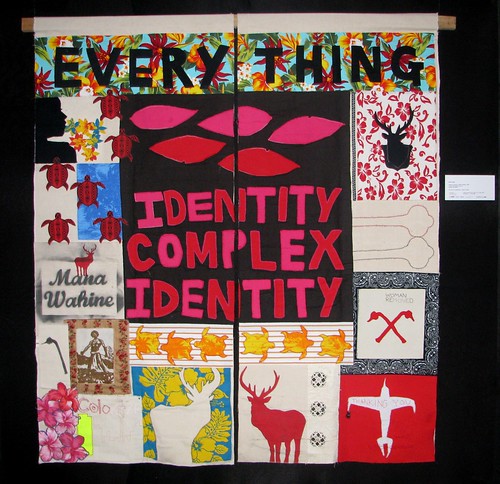
These are various pieces of work by the reknowned, yet controversial artist, Tracey Emin. Her work inspires me through the way that it looks messy, but gets a message across. The colour palettes she also uses are not ones that you would initally think would work. I love the controvercy she creates through her work, and the way some words she uses are purposely misspelt. I especially like the use of textiles in this piece and to create this effect I could scan different fabrics and edit them on photoshop onto my own magazine. I feel that these can be used as great inspiration for my piece as i want it to look fun, and creative, to develop upon these pieces though I would like to use photography, as this is one area that she has not included in her piece, other than that - the font, colours and patterns of the piece are exactly what i want to portray through my piece.

Beginning of final coursework

For my final coursework piece I have chosen to create a music magazine. Firstly I must explore different ellements that will help me decide on the overall look of the final piece. I have chosen to use high fashion magazines, mixed with fine artists' work to create a unique piece, that will entice a reader to look further inside. I have chosen to use the female reader of an age of roughly 16-25 as my target audience, as this means I can use my own perspective to know that what I am creating would be successful. I have decided on a piece that is very textile based in its look, I want it to show a lot of texture, as though it looks like you could pull bits off of it - as though it was hand made. I can create this look by scanning different materials and components and then editting them onto photoshop to add to my magazine. Overall I want it to look very decorated and exciting, as this is the type of magazine I would enjoy reading myself.

Followers